Green is one of the most versatile and meaningful colors in the visual toolkit of any brand. From its natural associations with growth and renewal to its modern links with sustainability and innovation, green holds a unique place in color theory—and an even more powerful role in marketing and retail design. For brands, shops, and e-stores looking to refine their identity, green offers an opportunity to communicate clarity, calm, and purpose through every touchpoint, from logos and packaging to social graphics and storefront displays.
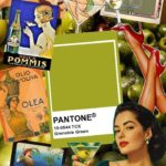
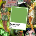
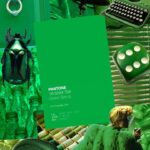
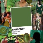
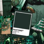
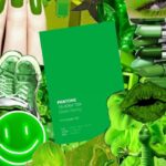
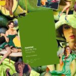
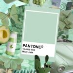
For this article, we’re drawing inspiration from curated Pantone-based green color collages—visual collections that highlight the depth and diversity of green. These reference points aren’t just aesthetically pleasing; they help demonstrate how nuanced this color really is, and how many creative directions a brand can take within this single hue.
Whether you’re building a new brand or refreshing your visuals for the next season, here’s why green deserves a place at the top of your palette.
The Meaning of Green in Color Theory
In color psychology, green is most commonly tied to nature—grass, plants, forests, fresh produce. But its meaning extends deeper than “eco-friendly.”
1. Growth, Stability & Renewal
Green symbolizes growth and steady progress. While blues often communicate calm and dependability, greens carry a sense of movement forward. For retailers, this can support messages around self-improvement, positive change, or lifestyle upgrades.
2. Balance & Harmony
Green sits at the center of the color spectrum, physically balancing warm and cool tones. Because of that, it naturally evokes emotional balance as well. Brands use green to soothe the eye, create visual harmony, and convey a sense of groundedness.
3. Health, Freshness & Wellness
Many food, skincare, supplement, and lifestyle brands choose green because it immediately communicates “good for you.” It signals clean ingredients, natural sourcing, and fresh experiences—perfect for modern consumers who are increasingly label-conscious.
4. Prosperity & Abundance
Green also has financial symbolism, especially in the U.S. Its connection to money, wealth, and growth can be subtle or pronounced, depending on the shade. A deep emerald can feel luxurious and high-end, while a crisp, citrus-toned green can suggest energetic growth or forward momentum.
5. Innovation & Sustainability
In the last decade, green has been adopted as the universal color of eco-consciousness. Brands committed to environmental responsibility often use green to highlight planet-friendly practices, recycled materials, or energy-efficient products.
How to Apply Green Effectively in Design & Branding
Not all greens communicate the same things. The Pantone spectrum alone shows how dramatically a brand’s message can shift with different shades. Using green strategically means choosing the right tone, pairing it effectively, and applying it consistently across your brand ecosystem.
1. Choose a Green That Matches Your Brand Personality
Here are examples of how various greens influence perception:
-
Soft sage or eucalyptus greens → calming, modern, minimal
-
Bright lime or chartreuse greens → energetic, youthful, disruptive
-
Deep forest or pine greens → earthy, trustworthy, established
-
Emerald or jewel-toned greens → premium, elegant, elevated
-
Muted moss or olive greens → heritage-inspired, rugged, dependable
Your brand’s personality—not just your industry—should guide your shade selection. A boutique skincare brand may lean toward soft botanical greens, while a high-end retailer may prefer rich emerald tones.
2. Use Green Strategically in Your Visual Hierarchy
Color is one of the first ways customers navigate information. Green can be used to:
-
Highlight CTAs in a way that feels soft but intentional
-
Draw attention to sustainable product lines or seasonal collections
-
Create a “breathable” layout that supports calm browsing
-
Reinforce trust on checkout pages or key conversion blocks
Because green is easier on the eyes than more saturated colors, it’s ideal for backgrounds, section dividers, or subtle accents that support easy reading.
3. Pair Green With Complementary Colors for Impact
Green pairs beautifully with a wide range of hues:
-
Green + White → clean, refreshing, modern
-
Green + Beige/Tan → earthy, warm, lifestyle-focused
-
Green + Black/Charcoal → bold, luxurious, professional
-
Green + Pink/Coral → playful, trendy, attention-grabbing
-
Green + Navy → mature, trustworthy, timeless
This flexibility makes green a strong foundational color for both minimalist and maximalist aesthetics.
4. Use Green to Guide Emotion and Behavior
Color theory isn’t just about beauty—it’s about behavior. Green can make digital shoppers feel:
-
more relaxed while browsing
-
more confident in a brand’s values
-
more trusting of product quality
-
more connected to natural materials or ingredients
In a retail environment, green-themed merchandising or signage can create a calm, inviting atmosphere, subtly encouraging shoppers to take their time.
Why Green-Inspired Creative Assets Benefit Retail Brands
Whether you’re a boutique in Lynchburg, a regional chain, or a national estore, creative assets rooted in strategic color choices can shift how customers interact with your brand. Here’s why green-based inspiration boards and Pantone-driven collages can help shape compelling visual direction.
1. They Help You Visualize a Cohesive Brand World
Seeing multiple green tones together helps you understand the spectrum available—everything from soft mint to deep evergreen. Collages make it easier to define the “feel” you want your customers to experience.
2. They Support Seasonal or Campaign-Based Storytelling
Green works beautifully across seasons:
-
Spring: fresh mint and light botanicals
-
Summer: tropical citrus and bold lime
-
Fall: moss, olive, and warm earthy greens
-
Winter: dark emerald and pine
A collage or graphic inspiration board makes it simple to map out seasonal shifts without losing brand consistency.
3. They Inspire Product, Photography, and Merchandising Choices
Color-driven creative assets can influence:
-
apparel or product colorways
-
packaging design
-
store displays
-
photoshoot styling
-
website accent colors
-
social media themes
For retail brands, this type of visual cohesion is a major differentiator.
4. They Help Align Teams and Creative Partners
Whether you work with photographers, designers, printers, or digital marketers, a color-based inspiration set keeps everyone aligned. With clear reference points—like the Pantone-specific graphics for this article—you can eliminate confusion and ensure consistency across all platforms.
Stay Inspired


Bringing It All Together for Your Brand
Green is more than a color—it’s a strategy. When applied intentionally, it can help shape a brand that feels trustworthy, modern, and connected to the values customers care about today. For retailers and estores, color-driven creative guidance strengthens visual storytelling, enhances customer experience, and provides structure for ongoing branding decisions.
At The Shop Shop, we use curated color collages and Pantone-based palettes to help brands explore new visual directions with clarity and creativity. If you’re looking to refresh your branding, plan a seasonal campaign, or develop a cohesive set of assets, green may just be the perfect place to start.
Understand Shopping Trends
We’re dropping our next newsletter in July 2026. Sign up for exclusive freebies, giveaways, and industry insights.