If you’re a coach, consultant, therapist, strategist, mentor, or basically any service provider who gets paid for expertise, there’s a good chance you’ve thought about redesigning your website.
Maybe it feels outdated. Maybe your content is buried. Maybe it technically works, but somehow still feels like the online equivalent of a waiting room with fluorescent lighting and expired magazines. Or maybe—and this one is incredibly common—you invested in a website years ago and now it feels impossible to update without accidentally breaking something.
A redesign sounds exciting. Fresh visuals. Better branding. Cleaner layouts. But here’s the uncomfortable truth: A beautiful website alone will not get you more bookings.
You can spend thousands on gorgeous fonts, cinematic animations, and mood-board-worthy photography, but if your website isn’t designed to build trust, guide people toward action, and actually support how your business works, you’ve essentially bought a very expensive brochure.
For coaches and service providers, a website redesign should do more than “look modern.” It should help you book more discovery calls, nurture trust, showcase expertise, organize content, and make your business easier to run.
The good news? Most coaching websites don’t need magic. They need strategy.
First: Stop Thinking of Your Website as a Portfolio
One of the biggest mindset shifts for coaches is understanding what your website is actually supposed to do. Many service providers accidentally treat their websites like digital résumés. They list credentials. They explain their philosophy. They add a long About page. Maybe there’s a services section somewhere if people scroll far enough. And then they wait.
But people don’t hire coaches because the website exists. They hire coaches because the website helped them feel confident about taking the next step. Your website should be functioning like a guided conversation.
A visitor arrives with questions:
- Can this person help me?
- Do they understand my problem?
- What makes them different?
- Can I trust them?
- What happens next?
- Is this worth my time or money?
Your website should answer those questions naturally while gently moving someone toward booking. That’s the real purpose of a redesign. Not aesthetics. Clarity.
The Biggest Mistake Coaching Websites Make: Too Much Information, Not Enough Structure
Here’s the thing about coaches: You know a lot. Which is wonderful. But it also creates a problem. Many coaching websites are overloaded with information because expertise naturally leads to complexity.
You’ve developed frameworks. You’ve written articles. You have podcasts. Books. Resources. Testimonials. Philosophies. Methodologies. A nuanced perspective.
Suddenly your homepage has become a 4,000-word manifesto and visitors are emotionally exhausted before they find your booking button. This is where smart website structure matters.
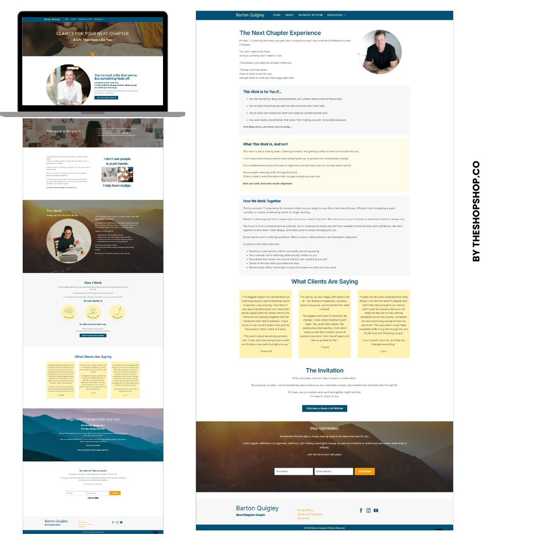
One of our recent coaching website redesign projects is a great example. The client had years of valuable content and resources, but the existing website struggled to organize it in a way that felt approachable. The theme itself limited flexibility, making edits difficult and leaving important information buried beneath walls of text.
The issue wasn’t a lack of expertise. It was presentation. We approached the redesign with a simple question: How do we make all this expertise easier to experience?
Instead of removing information, we reorganized it. The homepage was broken into visually distinct sections that made content easier to digest while strategically guiding visitors toward booking calls. Same expertise. Better experience. That distinction matters. Because people don’t avoid long content. They avoid overwhelming content.
What Every Coaching Website Actually Needs
If you’re redesigning your website, there are a few non-negotiables. No trendy design can replace these fundamentals.
1. A Clear Promise Above the Fold
When someone lands on your website, they should immediately understand:
- Who you help
- What problem you solve
- What outcome you provide
- What action they should take next
This is not the place for vague branding language. “Helping humans step into their highest selves through aligned transformation.” Respectfully… what does that mean?
Your visitor is confused. Confused people don’t book. Clarity converts. Instead, think about specificity.
Examples:
- Executive Coach:
Helping burned-out leaders create sustainable careers without sacrificing their personal lives. - Business Coach:
Helping creative business owners simplify growth and increase profit. - Relationship Coach:
Helping couples rebuild trust and communicate better.
Simple beats clever almost every time. And yes—you can still sound like yourself. Just don’t make visitors decode your business.
2. Strategic Calls-to-Action (Not Just One Lonely Button)
A surprising number of coaching websites hide the booking link like it’s an Easter egg. There’s one tiny “Contact Me” button tucked into the menu. Maybe. If people scroll enough. Your website should make next steps obvious. That doesn’t mean becoming aggressive or salesy. It means reducing friction.
Every page should gently guide visitors toward something meaningful:
- Book a consultation
- Schedule a discovery call
- Apply to work together
- Download a resource
- Join a newsletter
- Listen to the podcast
During our coaching website redesign project, one major improvement involved strategically elevating calls-to-action throughout the homepage. Rather than expecting visitors to search for how to book, booking opportunities were integrated into natural decision points across the page. When trust increases, action should feel easy. Not hidden.
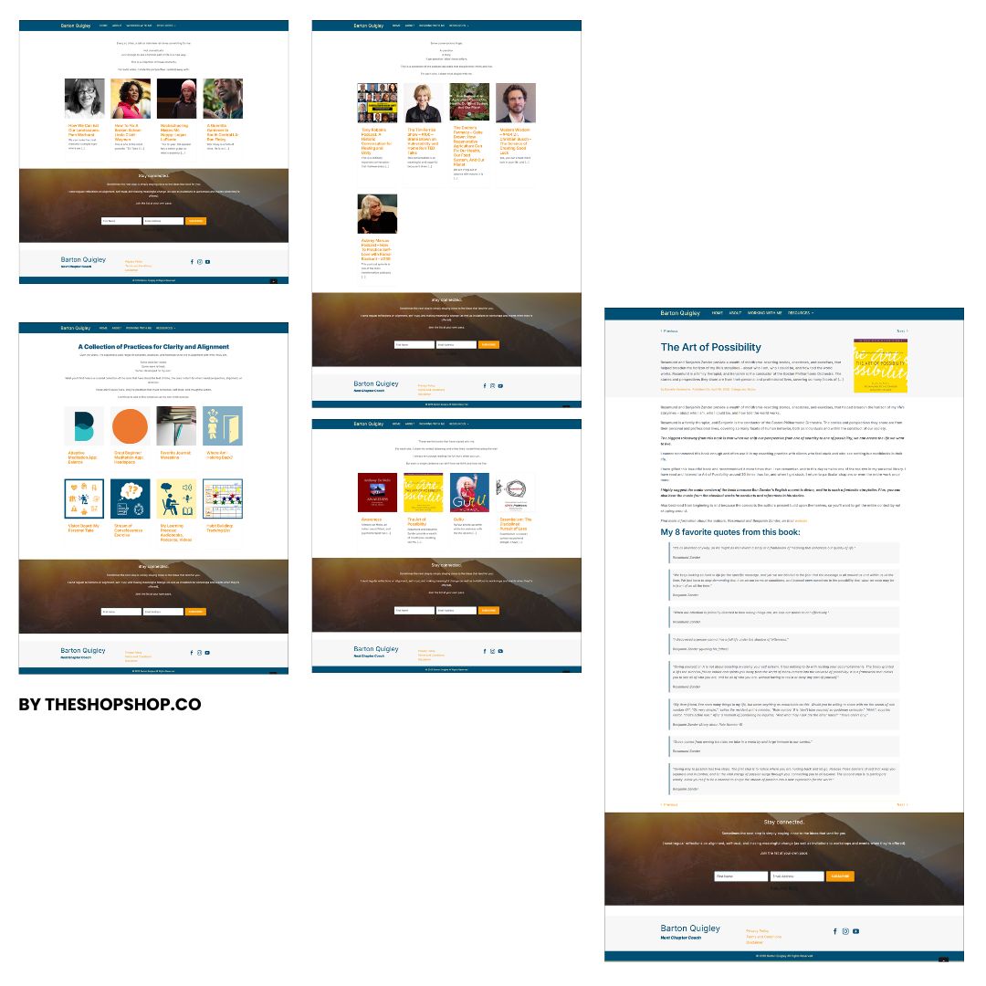
3. Your Website Needs Better Content Organization
Here’s a tough question: Can people actually find your best content? Many coaches produce incredible material and then accidentally bury it. You have years of podcasts, blog posts, downloadable resources, and recommendations floating around with no real system.
Visitors want direction. Especially if they’re new. In the coaching redesign we worked on, the resources section became a major opportunity. Instead of treating resources like one giant miscellaneous bucket, we organized content into structured archives by category:
- Books
- Podcasts
- Articles
- Educational resources
Suddenly the site became easier to navigate. And more importantly? The expertise felt more impressive. Organization signals professionalism. Chaos signals overwhelm.
Why Blogs Still Matter for Coaches (Even If You Hate Writing)
Every few months someone declares blogging dead. Meanwhile Google, AI search tools, and human beings continue consuming useful written content. For coaches, blogging still matters enormously. A good blog helps you:
- Build trust before the sales call: People often want proof that you understand their problems. Thoughtful articles create confidence.
- Improve search visibility: Every blog post becomes another opportunity for discovery.
- Support long buying cycles: Coaching decisions take time. Blogs keep you relevant during that consideration phase.
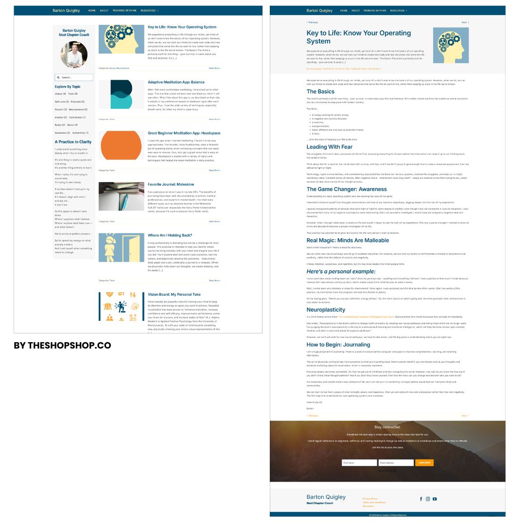
- Establish authority: Helpful content positions you as the obvious expert. But—and this matters—a blog only works if people actually want to read it.
Which means your design matters too. In our coaching redesign project, we intentionally redesigned the blog experience to encourage deep reading. The archive itself became more visually engaging, helping visitors explore topics rather than feeling overwhelmed by endless article lists. On individual blog posts, we simplified the reading experience to focus attention on the writing itself. Better spacing. Better hierarchy. Cleaner typography.
And thoughtful pathways to the next article. Because the best blogs don’t end when the post ends. They encourage exploration.
Your Homepage Is Not Supposed to Tell Your Entire Story
This is one of the hardest lessons for coaches. You want to explain everything. Your process. Your credentials. Your philosophy. Your origin story. Your framework. Your values. And honestly? It makes sense.
Trust matters in coaching. But your homepage isn’t supposed to answer every question. Its job is to create momentum. Think of it like this: Your homepage should spark curiosity—not exhaustion.
It should guide people deeper into the website. Not force them to read a textbook before deciding if they like you. A good homepage usually includes:
- A strong hero section: Clear messaging and obvious next step.
- Social proof: Testimonials, press, credentials, outcomes.
- Service overview: How you help.
- Educational authority: Content, podcast, blog, resources.
- Process or methodology: What it’s like to work with you.
- Strategic calls-to-action: Repeated naturally throughout.
Notice what’s missing? Three thousand words explaining every nuance of your business. You can absolutely share depth. Just do it strategically.
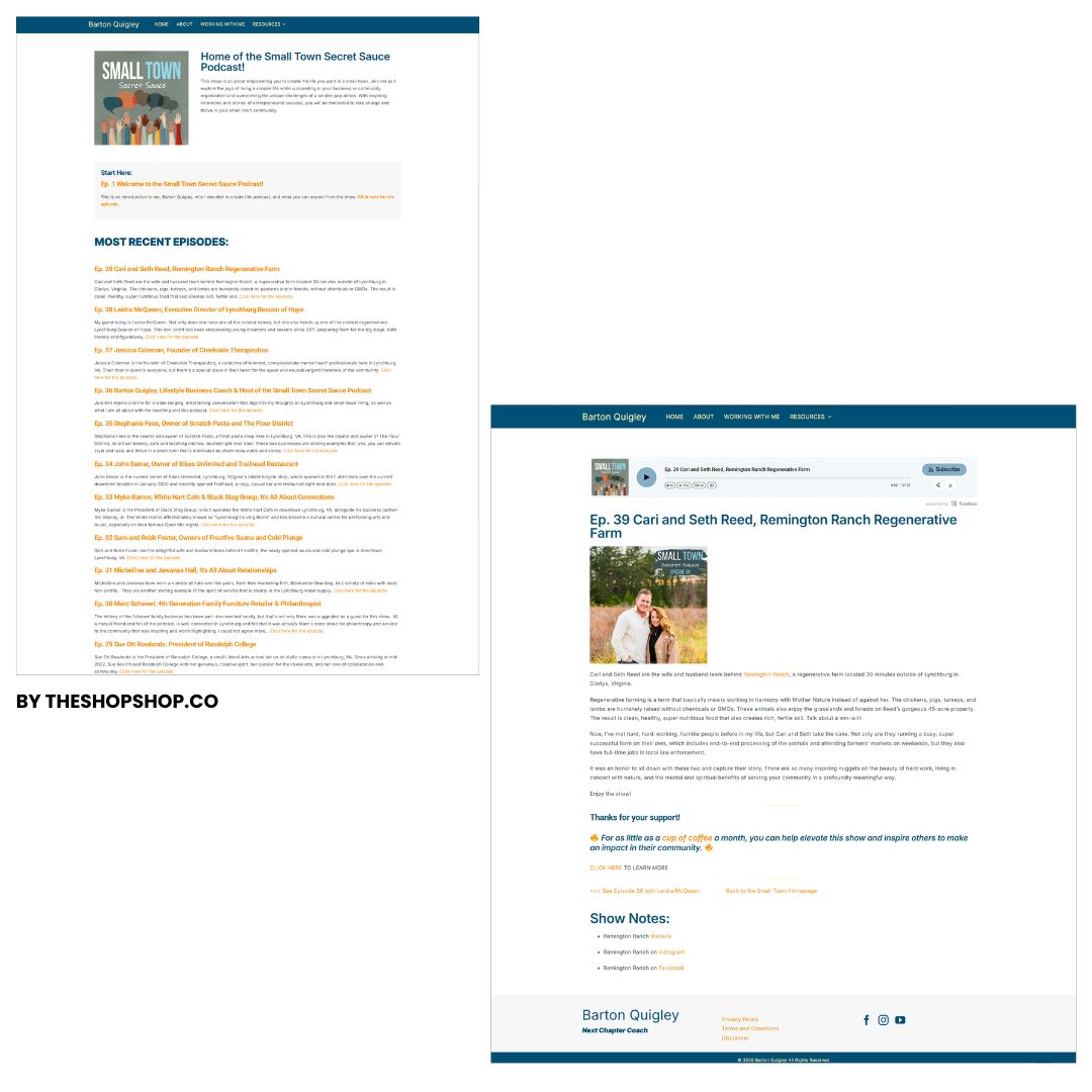
Why Podcasts Are Criminally Underused on Coaching Websites
If you have a podcast, please stop burying it. Seriously. Podcasts are trust accelerators. People spend literal hours listening to you think. That’s incredibly valuable. Yet many coaching websites treat podcasts like an afterthought.
Tiny menu link. Random embed. No structure. No archive. No browsing experience.
In our redesign project, we created a dedicated podcast archive designed to feel intuitive and pleasant to browse. Episodes became easier to access, easier to explore, and easier to binge. That matters because podcast listeners often become highly qualified leads. The longer someone spends consuming your ideas, the warmer they become. Your website should support that relationship.
The Secret Weapon Most Coaches Don’t Think About: Easy Updates
Here’s something wildly unsexy but incredibly important: Can you actually maintain your website? Many redesigns look beautiful… until the coach realizes they now need a developer every time they want to change a sentence.
That’s not freedom. That’s a hostage situation.
A smart redesign prioritizes flexibility. In this coaching project, we implemented global content areas across the website. Important calls-to-action and repeated messaging could be updated once and automatically populate throughout the site.
One update. Site-wide change. No hunting through pages. No inconsistent messaging. No tech stress. This matters more than people realize. Because websites fail when they become too difficult to maintain.
SEO for Coaches: The Part Everyone Avoids
Let’s talk about search engine optimization. Yes, it’s less glamorous than branding. Yes, it matters anyway. A redesign without SEO is like renovating a store nobody can find. For coaches, SEO isn’t just about rankings. It’s about discoverability.
- What are people actually searching for?
- What problems are they trying to solve?
- What language are they using?
During our coaching redesign project, keyword research helped identify focus keywords for existing pages. We also created a future content roadmap prioritizing strategic keyword opportunities. This gave the client something incredibly valuable: Direction.
Instead of guessing what to write about next, they had a prioritized content strategy aligned with how their audience actually searches. That’s the difference between random content and intentional growth.
Why AI Search and “Agentic Overviews” Matter Now
Search behavior is changing quickly. People increasingly use AI-generated search experiences to summarize information and recommend sources. That means coaching websites need structure. Clear topic authority. Strong organization. Helpful content. Proper formatting. Internal linking. Content clusters.
Translation? If your website is confusing to humans, it’s confusing to AI too. Well-structured coaching websites are more likely to surface in future search experiences. Which makes redesign decisions even more important.
Before You Redesign Your Website, Ask Yourself These Questions
Before spending money, ask:
- What is currently frustrating people? Not what annoys you.
- What blocks conversions?
- What content already performs well? Don’t reinvent successful material. Improve presentation.
- Are bookings easy?
- Could someone schedule a call in under 10 seconds?
- Is expertise organized? Or buried?
- Can the website scale? Will it support future growth?
- Can you actually update it? Because no one wants a gorgeous website they’re afraid to touch.
Your Website Should Work Harder Than You Do
A coaching website shouldn’t just sit there looking pretty.
It should:
- Build trust
- Educate visitors
- Showcase expertise
- Organize resources
- Encourage action
- Improve discoverability
- Support future growth
- Make bookings easier
The best redesigns don’t simply modernize aesthetics. They improve function. That’s exactly what happened in the coaching website project we shared throughout this post. By improving flexibility, restructuring content, organizing resources, redesigning the blog and podcast experience, simplifying updates, and building an SEO strategy, the website became more than a digital brochure.
It became a business tool. And that’s really the goal. Because the best coaching websites don’t just explain what you do. They quietly help people feel ready to work with you. And when done right? That booking button starts getting a lot more attention.
Understand Shopping Trends
We’re dropping our next newsletter in July 2026. Sign up for exclusive freebies, giveaways, and industry insights.